GoToAction Philosophy
The Datagate dashboard is built on a simple question: what do I need to do now?
It's not a graph board or a summarized report. It's the starting point of the workday — the place where the user sees immediately what needs their attention, without searching through menus or opening reports.
When a salesperson opens the app in the morning, they see the due invoices and the ones that are about to expire. When a logistics operator logs in, they see the orders that need to be delivered today. When a store manager enters the system, they see the day's performance and alerts that require intervention. Each role sees its own set of information—relevant, actionable, up-to-date.
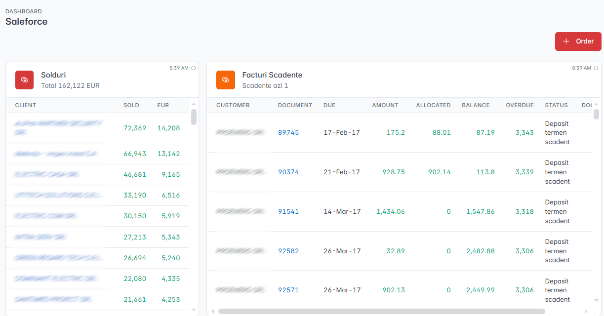
What's in a Dashboard
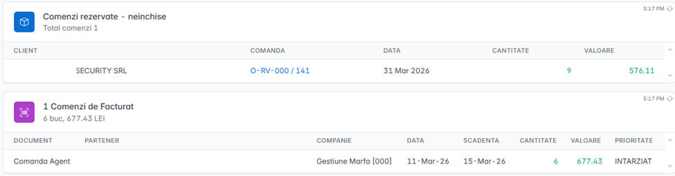
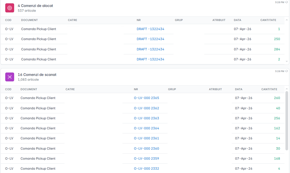
Tasks are the actions that wait for the user's intervention. They can be orders to deliver, documents to approve, receipts to check, or any other operation that requires a decision or manual action. Tasks are ordered by priority and urgency — the most pressing appear first.
Notifications inform the user about events that have already happened: a completed receipt of goods, a processing error, a background task that has failed. Unlike tasks, notifications don't necessarily require action — but they do signal situations that might require attention.
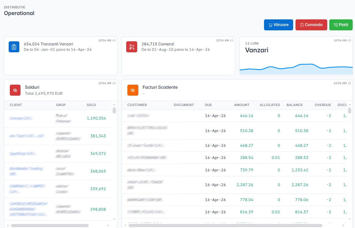
Summary indicators give the big picture at a glance: sales of the day, number of pending orders, delivery rate, store performance. They are aggregated data, meant to answer "how are we?" without going into details.
Quick actions are shortcuts to the operations that the user does most often. Instead of navigating through menus, it can launch a new order, reception, or frequent report directly from the dashboard.
Automatic update
The dashboard refreshes itself at a configurable interval. When a new order enters the system or when a colleague completes a shipment, the dashboard reflects the change without the user reloading the page.
The refresh interval is adjusted according to the operational pace — minutes for a busy warehouse, a few tens of minutes for an administrative office.
What is NOT the Dashboard
The dashboard doesn't replace reports. A report provides detailed, historical data with complex filters and exportability — it's the analysis tool. The dashboard provides a summarized and action-oriented picture — it is the operational tool.
| Dashboard | Reports | |
|---|---|---|
| Question | What should I do now? | How did last month go? |
| Date | Summarized, in real time | Detailed, historical |
| Update | Automatic, continuous | On request, as needed |
| Purpose | Immediate action | Analysis and decision |
The two complement each other: the dashboard shows that today's sales are below expectations, the report shows why.