Basic principle
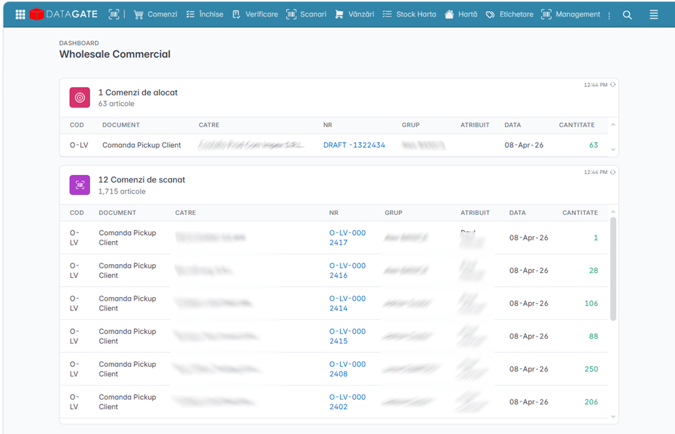
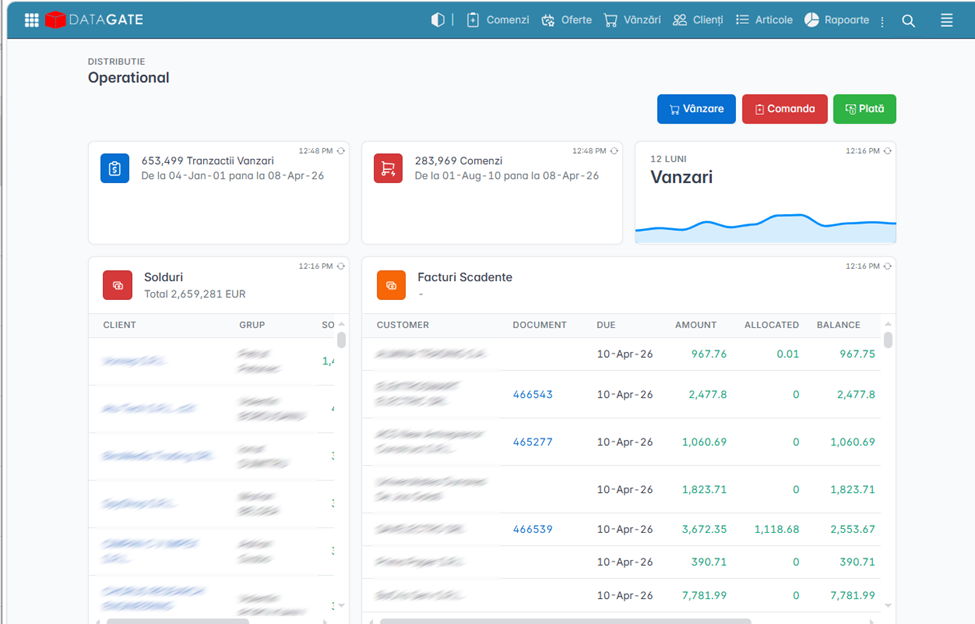
Datagate's interface is built on a simple rule: each user only sees what is relevant to their role. There is no fixed interface that roles only restrict. There is no universal menu that shows everything to everyone.
Instead, each module is designed from scratch for a specific purpose. A warehouse operator sees locations, quantities, and scan instructions — but they don't see prices, because they don't need them and it would be a risk to see them. A salesperson sees customers, orders, and invoices — but he doesn't see warehouse locations because they don't look at him. This separation is not cosmetic — it is structural, directly related to the security system and the roles defined in the platform.
Why Module Separation
Business processes become complex as the company grows. Let's take a seemingly simple example — an online delivery:
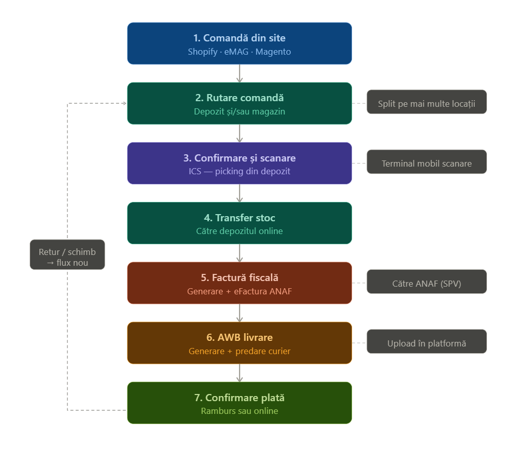
If the customer makes a return or exchange, the list continues with a series of more steps. If we add segmentation by access rights at each step — who can see, who can approve, who can cancel — it becomes obvious that a single interface for everything doesn't work.
That's why Datagate isolates each process in its own interface, organized by workflow and roles. The result is an app where every user has exactly the tools they need, with no noise and no risk of making mistakes due to too many options.
Fonts
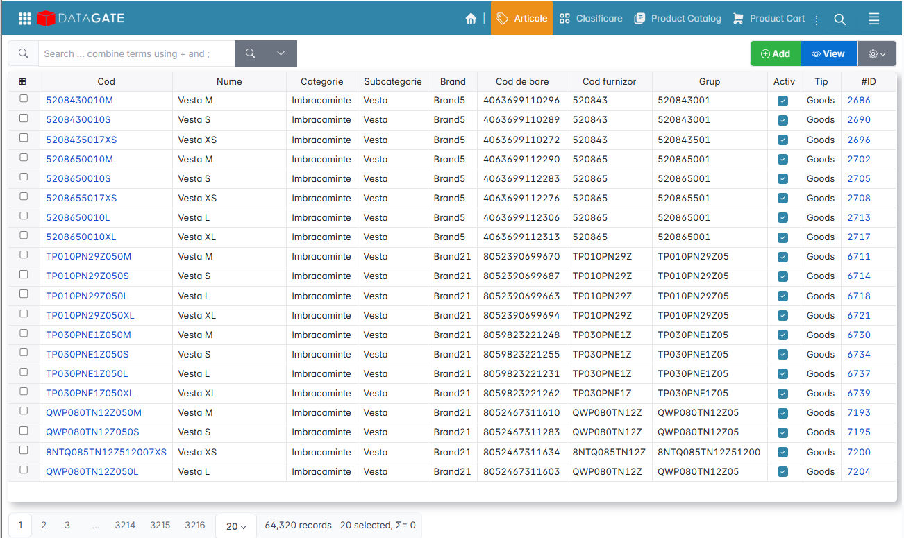
Fonts are not only chosen for aesthetics, but for operational precision. In an environment where users scroll through lists of hundreds or thousands of lines daily, readability makes the difference between a correct operation and a costly error.
The digits are the same width (monospaced), so they line up perfectly under each other in columns — essential for quick checking of quantities and prices. The shapes of the numbers 3, 9, 7 and the letter "a" are specially chosen so as not to confuse with each other, even at small sizes or on low-resolution screens.
Colors
Colors are standardized and associated with actions: saving looks different than delete, confirmation looks different from undoing. The contrast is high enough that critical actions are instantly recognized, without reading the button text. At an intense pace of work — a supermarket cashier, a warehouse operator with a scanner — this visual distinction prevents errors.
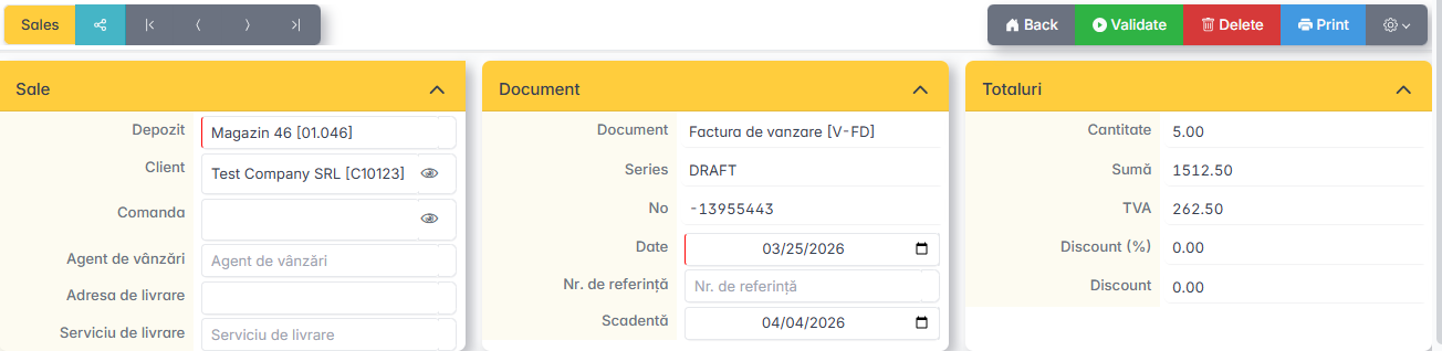
Multi-language
The interface supports multiple languages. The translation is done at the platform level, without structural changes — the same module, the same screens, another language. This capability is relevant for companies with international operations or employees who speak different languages.
Navigation
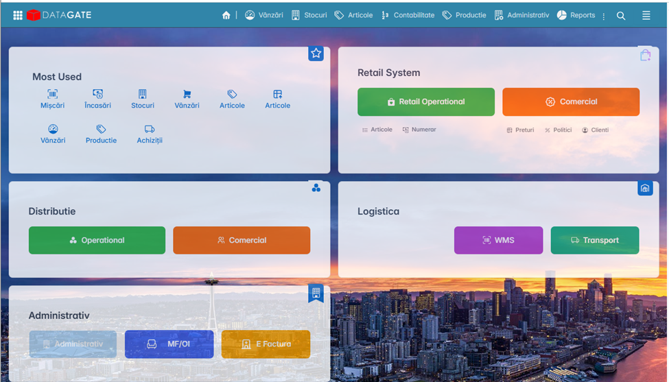
The main menu is positioned at the bottom of the page. This choice is not accidental: on mobile devices and touch screens, the bottom of the screen is the most accessible for the thumb. On the desktop, the menu remains visible and accessible without scrolling.
From the menu, the user can reach any section of the app with a single tap or click.
Responsive
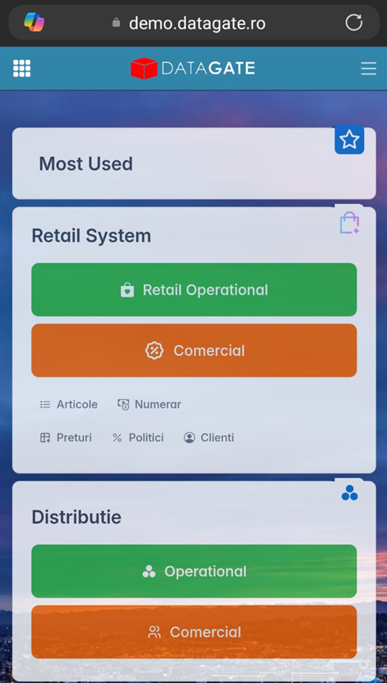
The interface works on any screen size — from desktop monitors to mobile phones — without losing functionality. The layout is automatically rearranged: columns are rearranged, tables become scrollable, buttons are resized.
This is essential in practice: ICS runs on mobile scanning terminals in the warehouse, SFA on field salespeople's tablets, and Business Essentials on office desktops — the same platform, the same app, different screens.